


The Font for the Next Four
A deep look at the design of the Trump and Biden campaign logos
October 28, 2020
 Logos are the renaissance men of graphic design. They need to be simple, yet representative. Good logos can effortlessly be integrated onto t-shirts, bumper stickers, letterheads, billboards, face masks and everywhere in between. As Election Day draws near, campaign logos are everywhere we turn.
Campaign graphic designers are given the difficult task of designing a logo that can represent a candidate, their platform and their party.
Beginning with their technical aspects, Donald Trump’s campaign logo uses the font Akzidenz-Grotesk, designed by Berthold, for his and his running mate Vice President Mike Pence’s names. FF Meta, designed by FontFont, is used for the slogan as well as “2020.” In its most basic implementation, the text is white over a blue background with red stars and wireframing.
The Joe Biden and Kamala Harris logo utilizes the sans serif font Decimal, designed by Hoefler&Co. Hoefler&Co actually designed the entire logo, which graphic design professor Abby Goldstein pointed out was a little unusual.
![]()
“It does away with the designer and goes straight to the typeface designer,” said Goldstein. “This goes back in a circle to the printer/typesetter relationship with the client.” When the possibilities of graphic design were limited to the capabilities of the printing press they had, the operator of the press, the typesetter, became the de facto graphic designer.
 Before Biden announced Harris as his running mate and added her name to his logo, the solo Biden logo used Brother 1816, designed by TipoType. All of the text is blue with the exception of a red “E” in Biden.
Trump’s incumbency presents some advantages in the logo race. People have been seeing the Trump/Pence logo for over five years now throughout his first term and his campaign before that. People are more than familiar with the classic box logo by now. Supporters of Trump already have their merch from the 2016 race and videos from Trump rallies clearly show how popular said merch is among attendees. 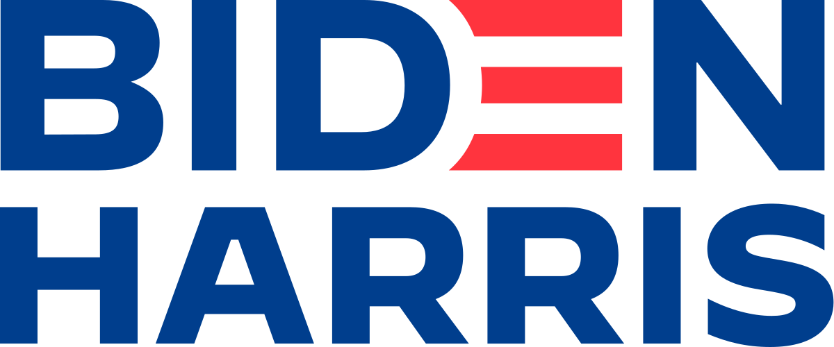

The Biden/Harris logo gets a little more clever. The “E” in Biden is red and lacks a stem to allude to the red and white stripes of the American flag. The campaign does the same thing with the “E” in Joe when using the alternative first-name logo. The stripes are simple and easily adapted for different uses.
 Looking at the favicons, or the small icons on the different tabs of an internet browser, of both campaign websites, Biden’s stripes show up again in front of a “B.” Once again, the Trump campaign goes even simpler with a distinct, blue “T.”
When Trump announced that Mike Pence would be his running mate in 2016, the campaign experimented with a different logo. The new design was meant to convey partnership by having the stem of the “T” in Trump run through the bowl of the “P” in Pence. The internet was quick to point out an obvious lewd interpretation of the logo and the campaign quickly returned to the classic Trump/Pence logo.
Something we see in Trump’s logo and not Biden’s is the inclusion of his campaign slogan. “Make America Great Again,” or “MAGA,” has gone on to take up a life of its own. From chants to the infamous red hats, including this slogan in the logo was essential to their campaign. The fact that the slogan is so short makes it easily fit into the logo as well.
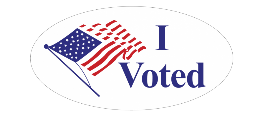
 It’s easy to see why Biden did not include his slogan — no one knows it. The Biden/Harris campaign slogan is “Battle for the Soul of the Nation,” in case you were wondering. Including this clunky slogan on their logo would ultimately take away from the effectiveness of the design as a whole.
 ![]()
All that being said, graphic design professor Jessica Green is skeptical about the effectiveness of political logos at moving voters, citing Hillary Clinton’s 2016 loss in the presidential election.
“The Hillary Clinton ‘H’ was a beautiful mark, both in terms o f its abstract formal qualities and its symbolic resonance. It was pure and reductive but could also be adapted into many variations,” Green said. “I loved the way it evoked the history of Lester Beal’s Rural Electrification Administration posters.”
Green went on to say that Barack Obama won in 2008 off a campaign logo she saw as rather basic. Despite this, she said that he still won because “his political campaign’s dynamism imbued the form with meaning.”![]()
No matter who wins, their logo will still live. Twelve years after his first presidential race, Obama’s campaign logo can still be seen making the rounds on bumper stickers, t-shirts and more. Decades from now, the campaign logos will be in history books about the pandemic and their design will be as foreign to students as anything that old is to us.
However, that’s the thing about logos: They’ll still exist, and they’ll still represent the same thing.
Graphic illustrations by Lara Foley.