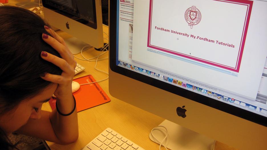
Students React with Mixed Emotions to Shift from OASIS to My.Fordham at Banner
June 25, 2011

Published: September 24, 2009
This semester, students at Fordham College at Lincoln Center (FCLC) officially switched from the old OASIS system to the new online portal, My.Fordham, to access the Banner system for class registration. Though some students are gradually seeing the accessibility to Fordham’s new service, the mixed responses to the new system by FCLC students have ranged from confusion to hatred.
“I hate it,” said Jenisse DePena, FCLC ’11. She said that, although Fordham may have wanted to update its system, this change only made things a little more complicated for students. “The system itself is so confusing because there is too much information on one page and it is harder to register and see which classes are available or closed,” said DePena.
However, not all students feel this way. Sophia Lee, FCLC ’12, said that, although registration for classes was a little complex, “Having Blackboard incorporated with My.Fordham is pretty convenient, so now I don’t have to log onto a separate Web site to access it.”
“My.Fordham (http://my.fordham.edu) will eventually be the gateway to all of Fordham’s online services,” said Fleur Eshghi, Ph.D., executive director of Instructional Technology Academic Computing (ITAC), in an interview conducted over Fordham’s online eNewsroom entitled “Fordham At Work: Fleur Eshghi, Ph.D.”
Eshghi said, “With one login, the portal will connect students, faculty and staff to online academic services and resources, including the Student Information System for registration and advisement, library databases, e-mail and Myfile (the new central storage system).”
Eshghi explained the ease with which students can use My.Fordham. “All you have to do is login once, and access all,” she said. “The company that produced OASIS, ERP, no longer supported it,” she said. Eshghi explained that My.Fordham will be one portal where students can “access development and finance, human resources and student information at their convenience with a single sign-on.” She said, “Convenience is created [for users] so everything is in one portal, and not scattered.”
FCLC students once used OASIS to help organize and register for classes. Although Fordham reminded students to create an AccessIT ID months in advance, some FCLC students may not have known the reason behind the shift from OASIS to My.Fordham. Many students did, however, think that the shift would create confusion and more work to relearn an entirely new system.
Laurene Francois, FCRH ’11 said, “I was annoyed [that] they made me use a different system.” She said, “Everything is there, but looking up classes was so confusing.” She said that the tutorial was there to help students learn how to use My.Fordham, but “it could only do so much.” Francois said that My.Fordham is of no use to her and that, other than registering for classes, she rarely logs onto the system.
According to Joshua Pachtman, FCLC ’12, a student worker for Fordham IT, “[My.Fordham] is terribly confusing.” He said, “It is too hard to find things… the password is annoying because it requires you to have a certain number of characters, but one has to be a capital letter and another has to at least be a number.”
Umair Khan, FCLC ’12, also a student worker for Fordham IT, said, “[My.Fordham] is unorganized because I couldn’t find a direct link to get to my class schedule.” Khan said, “I had to play around with the Web site for five minutes until I could find what I needed.” He said that creating this portal to include several features in one was a “good idea,” but that it could have been “better implemented.”
A second-year transfer student from American University described My.Fordham to be “simple” enough. Mike Mineo, FCLC ’12, said that it could have been very difficult to handle and said, “I registered in late August since I had to deal with transcripts and paperwork.” He did suggest one change: “if everything was in one screen and class registration had an add/drop button, as opposed to a catalogue on a different screen,” then it probably would have been more convenient.


