


My.Fordham Woes
August 29, 2015
When Fordham IT announced that the university’s internal Portal (my.fordham.edu) would be undergoing improvements, we were promised “a substantial upgrade to both its appearance and its underlying technology,” per an email sent by Elizabeth Cornell, director of IT Communications. Instead, the site has received minimal attention and very few useful updates, even though staff members and students use it on a daily basis.
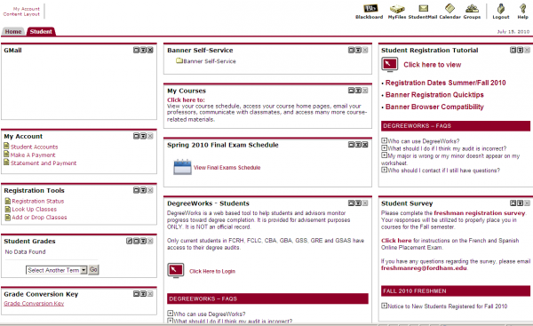
As such, the site remains in dire need of improvements, particularly given the flaws of the previous system. In my experience, the grid-like layout was not visually appealing, nor was it particularly conducive to discovering site resources. The self-service station was the only redeeming element, but this was organized in a simple folder structure reminiscent of a desktop file browser. The separation of content across the top tabs was especially confusing as well, since there was no way to see their respective content without clicking into them. Slow navigation speeds, an unstable desktop version and a completely broken mobile experience did not help the cause either.
Thankfully, some of these issues were taken into account in the Portal re-design. The new site does now feature improved speeds and a mobile site that is usable, and I can gladly say that I am no longer greeted by a ‘conflicting cookie error’ on mobile.
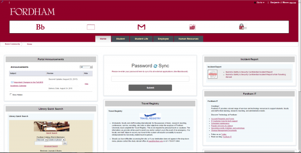
However, the real problem lies with the visual improvements, or lack thereof. For example, the default text throughout the site is even smaller than it was previously. Additionally, the color scheme across the site now includes different shades of yellow, blue and gray that do not mix well with each other or with the traditional Fordham colors. And although the email also stated that the “Portal interface [would be] easier to navigate,” the site resources are still scattered across various tabs and divided into various-sized tiles, which makes finding specific elements far from intuitive
The top header that includes icons for Blackboard, MyFiles, Gmail, Google Calendar and Password options are not well-implemented either. Visually speaking, the icons are a mix of modern-style icons (Gmail and Google Calendar), legacy icons (MyFiles and Password) and text (Blackboard). Also, with the exception of Gmail and Calendar, none of these icons should be in the same area on the page, as their functions are not very closely related.
Surprisingly, Blackboard hasn’t been touched, though it is in desperate need of an overhaul as well. The system is unnecessarily complicated even for basic tasks such as submitting papers for a class or downloading a syllabus. At least in my experience, professors will more often than not opt to use email to contact the class or send out documents instead of using Blackboard, which defeats the purpose of having the service in the first place. Furthermore, Blackboard isn’t integrated with any of the other Fordham services, which should have been fixed regardless of the updates to my.fordham.
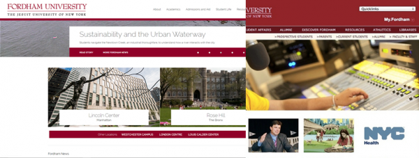
Improving the backend of my.fordham has seemingly fixed the most egregious problems of the site, but the visual design still feels incomplete and rudimentary. A successful revamp would have take into account both aspects of the site. Take the university’s main site (www.fordham.edu) for example, which has undergone significant changes over the past few months. There has been extensive work on optimizing this site and fixing broken links, as well as an overhaul of its design and layout. The end result is a modern and responsive site that puts the internal Portal to shame.
I understand that the main website has priority, given its wider audience, but it is disappointing that the student-focused site has not received anywhere near the same attention. But hey, everything works for now, right? That must count for something.