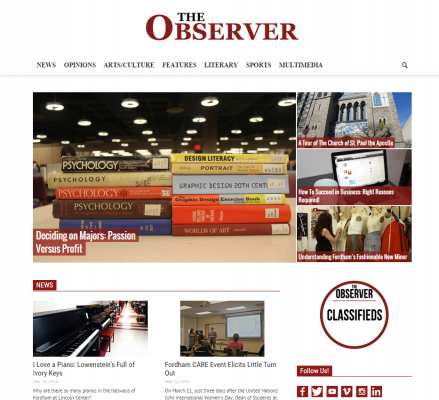
Observer Launches New Website
March 25, 2015
While everyone was catching up on sleep or “House of Cards,” or laying on a tropical beach in the middle of the Caribbean, a team of Observer editors (Ben Moore, our online editor, Adriana Gallina, our News Editor, and myself) locked ourselves in our newsroom for over 30 hours and revamped our online presence. Everything was on the table: from the Fordham Observer website to how we interact with online audience via social media, to even to what color maroon we wanted associated with our brand.
After spending the past few months discussing our online presence with the Editorial Board, we implemented certain changes. While reevaluating our mission and our online presence, we didn’t want to stray far from the history of The Observer, and its almost 35 years of service to the Lincoln Center community. This letter will introduce some of the more notable changes that we have implemented.
First, on the chopping block, was the website.After heavy consultation with the Editorial Board as well as our advisors (Professor of English Elizabeth Stone, Ph.D., Reporting; freelance artist and former MTV producer Roopa Vasudevan, Multimedia; New York Times designer Kim Moy, Layout; and Bloomberg BusinessWeek Picture Editor Amelia Hennighausen, Photo), we chose a new theme that allowed for easy navigation, that was stylish yet sophisticated and had strong video and photo story-telling capabilities. The new theme allows for various ways to showcase our content, as well as keeping it fresh and more visually appealing.
You may have noticed, while scrolling on Twitter or Facebook, that the Fordham Observer is no longer using the Fordham University seal as its profile picture or avatar. Instead, a new logo was designed, that took into account the history of The Observer’s past logos and branding, while launching that into the 21st century.
You’ll find that new photo has carried over to the new website, as well, in terms of colors, font and design. We’ve struggled in the past with having the best photos to illustrate our stories in the past and have often had to find a photo that doesn’t necessarily work well with the story just so we can publish it online. Now, we’ve created “placeholder” photos for each section, so we can publish breaking news stories quickly and efficiently and then go back and add a photo once we’ve obtained it. We’ve done the same for Staff Editorials, which will allow us to share our editorial board’s views and ideas more easily, instead of having them buried on the website for a lack of photo.
In addition to these changes, we’re also launching a new way to reach audiences: a weekly newsletter. During off-production weeks, a round-up of online content, including multimedia and photo essays, will be sent to our subscribers under the title “Observer Online.” During production weeks, content that appears within the new print edition will be sent to subscribers under the title of “Inside The Observer.” We also hope to establish a precedent of using our subscriber list to push out breaking news stories alerts since we do not have the capabilities of sending push alerts to people’s iPhone’s like the New York Times or CNN.
All these changes, some more major than others, are a way to push the Observer into the digital world – which is long overdue, considering the current state of journalism today. For that reason, you’ll begin to notice a heavier integration between print and online, with print stories pointing to an online only component and vice versa.
As Fordham grows here at Lincoln Center, The Observer wants to grow with it, so that we can actively act as the voice of the student population. And as the student population grows here at Lincoln Center, The Observer’s reach has to as well, and that means conquering the online and digital world, one step at a time.
Tweet us your thoughts about the new Fordham Observer website at
@FordhamObserver.


