

New Website Launch: More Changes to Come
December 22, 2014
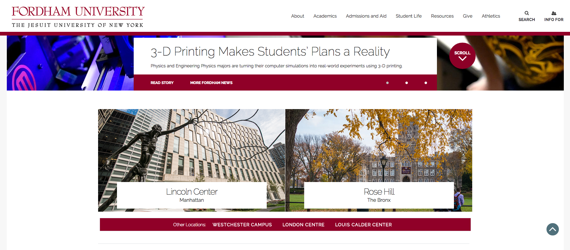
On Thursday, Dec. 4, Fordham launched the long-awaited new website. The updated site features 4,000 pages with new designs and is also formatted for mobile devices, as mobile traffic has been overtaking desktop traffic on the website.
In an email interview, Donna Lehmann, director of online communications at Fordham College at Lincoln Center (FCLC), said, “First and foremost, fordham.edu was overdue for a redesign, reorganization and an upgrade in management technology.”
The website, while updated, will not be a complete overhaul. Lehmann said that while most pages would get a redesign, there is still a lot to be done over the spring semester. “It will take some time to transition all of our web content into the new templates,” she said.
Students can anticipate an update to all the schools’ pages, including Fordham Law and the Gabelli School of Business – others include student affairs and most department pages.
However, my.fordham is not among the pages to get a redesign; at the current time, the update will only focus on the main website. Some students feel that my.fordham is in need of an update. Katherine Burks, FCLC ’16, said, “That portal’s ugly … I don’t think it’s set up optimally.” Dissatisfied, she also said, “It’s weird that DegreeWorks is all the way at the bottom.”
Matt Scheffler, FCLC ’18, agreed and added, “[This] is such an eyesore to look at. I feel like I’m in 1995.”
Lehmann is hoping that with the new pages and features, students will be able to offer feedback on the update so that changes can be made over the course of the next semester. “We’ll be looking to address as many issues as we can. While I’m interested in what students think about the size of the font or the behavior of a particular menu, I’m much more interested in how easily they can find what they need and how the site makes them feel about their school,” she said.
Young Eun Nam, FCLC ’16, upon seeing the new site, said, “I think the new website is cleaner and more beautiful design-wise.” However, she thinks it is still problematic, “because there is a picture, I can’t see everything at the same time.” The main page features a large photo feature that takes up the top half of the page. “I feel like the pictures could be a little bit smaller and the fonts bigger, because I feel like the menu doesn’t look important right now.”
Scheffler also felt like changes needed to be made. “It looks nicer but it’s not user-friendly. I think it’s clean … [the login button] is definitely a problem because it’s not very accessible … that really annoys me.” The login button was originally featured at the top of the page, but has now been moved to the very bottom. “It definitely needs to be more user-friendly.”