


Within Hudson Yards, there are a variety of restaurants and shops, congested with crowds of tourists and corporate workers looking for a lunch break escape. Up four sets of escalators, past Shake Shack and Dylan’s Candy Bar, there is also one of the newest NYCxDesign exhibitions featuring the iconic MUJI brand.
“MUJI IS: Behind the ‘Wa-ke’” focuses on the evolution of MUJI from 1980 to today, specifically emphasizing the way MUJI’s product tags have shaped the ethos of the brand. MUJI was founded in 1980 as a way to combat the foreign luxury brands that were gaining popularity in Japan. The Japanese term, “Wa-ke,” refers to the essence or reasoning behind a given product; MUJI’s “Wa-ke” has always been its simplistic and humble nature.
Prior to visiting the exhibit, I was not sure what to expect as I did not know the meaning of “Wa-ke” nor the integrity on which MUJI was founded. Living in New York City, I often stop into MUJI’s Soho store in order to buy supplies for school and my apartment. As a consumer of the brand, I was curious to learn more about MUJI and its founding principles at the exhibition.
The exhibit at Hudson Yards is extremely simple. There are no flashy objects nor thought-provoking pieces — which is completely the point. With MUJI, what you see is what you get.
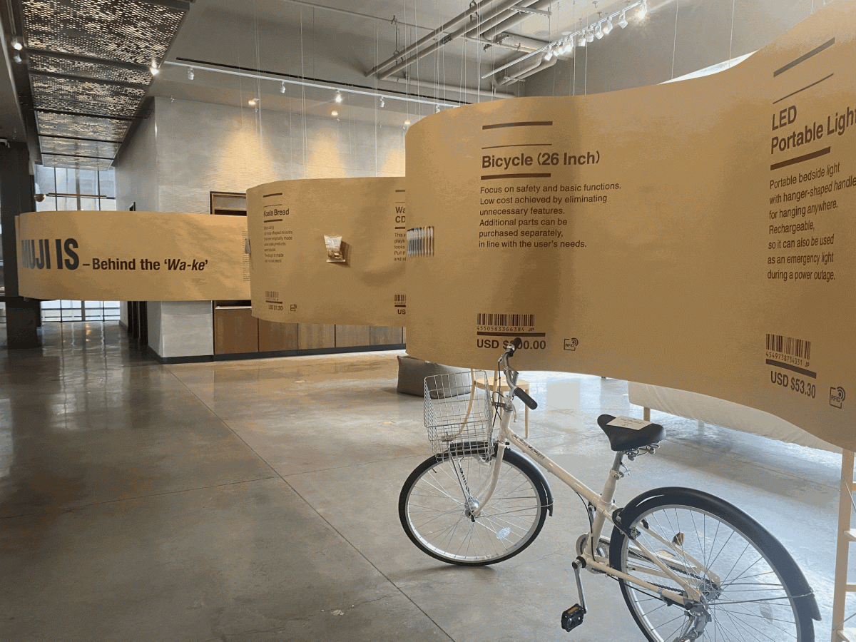
The exhibition space consists of a singular room in Hudson Yards. Sunlight streams in through the open windows, allowing exhibit goers to see the venue and tourist attraction the Vessel, and the hustle and bustle of the city beneath them. What looks like a long roll of brown paper weaves throughout the room. Stuck on to the long roll of paper are various everyday items you may find at a MUJI store. Upon entry into the exhibit, the attendant asks politely that you not touch any items as they are prone to falling off the paper. I was nervous about the quality in which the exhibit was put together as there were no display cases or other means to ensure the exhibit’s stability.
Walking straight into the exhibition room, one of the first items I noticed was a wall mounted CD player beside a series of refillable pens. Other items featured include a neck pillow, a plain white shirt and some silverware. A bare mattress and a bike sit on the floor. There is even food on display, such as a packet of koala shaped bread and butter chicken curry. The items displayed seem to be arranged in a random manner rather than in an organized fashion. I think it could have been neat for the items to be arranged in order of the brand’s evolution so that visitors to the exhibit could see how MUJI developed over the years.
MUJI is known internationally for its variety of staple household and consumer products such as soap and storage bins. However, the company also boasts many items that put a unique spin on everyday objects. One of the first items on display in the exhibition is a “semicircle hanger with pegs,” a shape that I have never personally seen a hanger take prior to visiting the exhibit. I wish that the exhibit had shone more of a light on the evolution of the brand’s repertoire to include their more unique items such as the hanger, instead of focusing primarily on the item’s product tags.
Displayed on the paper next to each item you will find the item’s individual product tag, each one blown up in size. This is the work of Miyuki Tokunaga, who has supervised MUJI’s copywriting atelier since 2001. Tokunaga’s direct product descriptions go hand in hand with MUJI’s minimalistic designs and manufacturing. The words on each individual product tag allow you to understand how the brand’s understated packaging and overly simplistic advertising has contributed to its ethos.
Product tags have served to ensure MUJI retains the integrity it was founded on. According to a wall of text introducing the exhibition, MUJI was founded on the principles of streamlining production processes, simplifying their packaging and carefully selecting materials — all of which cater towards their product makers, consumers and the environment. Simplicity is a hallmark of the brand.
As I read each product tag I knew exactly what I was getting from each product, building trust between myself and the brand. For that, I have great respect for MUJI and the work of Miyuki Tokunaga.
Take a unit shelf made of pine for example. Its product tag reads “Made from thinned lumber. Uncolored and untreated. Module sizes have been standardised and only the necessary sizes of wood are cut, decreasing lumber waste.” The shelf is listed at $177.50. The product tag for training pajamas made of side seamless double gauze reads “Carefully designed, including the colour and position of the buttons, so that children can put these on by themselves. Made from 100% organic cotton.” The pajamas are listed at $19.90.
I was particularly struck by how direct the language on the product tags were, many sentences consisting of simply a few words, with no flowery language nor unnecessary verbiage. Frankly, the super direct manner of the product tags lack personality and charm. Yet the words that are found on each product tag emphasize the rationalization of MUJI’s production processes, acknowledging that it makes every one of its products with their manufacturers, customers and the environment in mind. It is clear that MUJI does not stray from its founding principles. As I read each product tag I knew exactly what I was getting from each product, building trust between myself and the brand. For that, I have great respect for MUJI and the work of Miyuki Tokunaga.
Beyond the long roll of paper, you will find some more MUJI products organized in shelving, which looks like the products arranged at any given MUJI store. Items found here are actually for sale, such as sticky notes, household slippers and a heat proof teapot. There is even a cuckoo clock for purchase. The product tags are still displayed next to each product, but in their normal sizes. But, the nature of the exhibit ensures that you will take note of each and every one of MUJI’s product tags from here on out.
I left the exhibit with a new appreciation for MUJI’s products and ethos. Simplicity, humility and minimalism are much appreciated in an increasingly hectic world. “MUJI IS: Behind the ‘Wa-ke’” was open for a limited time between May 16 and June 12.