

The Man Behind ‘I ❤ NY’
Milton Glaser’s career and legacy go beyond New York tourism
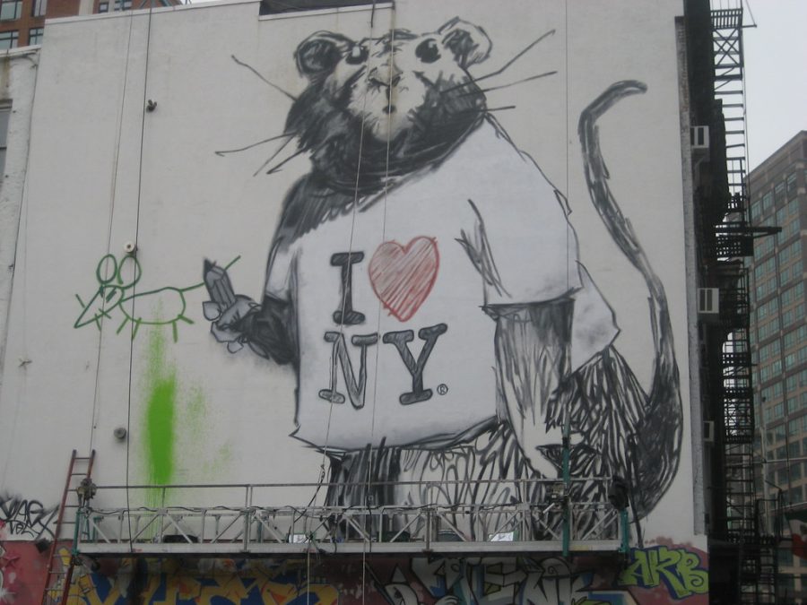
ORIGINAL ANTHEM VIA FLICKR
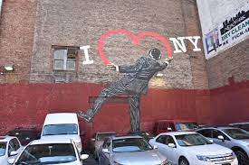
Real New Yorker sports the iconic slogan on a t-shirt. This mural brings Glaser’s design to a larger scale.
November 17, 2021
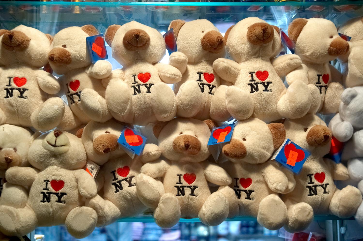
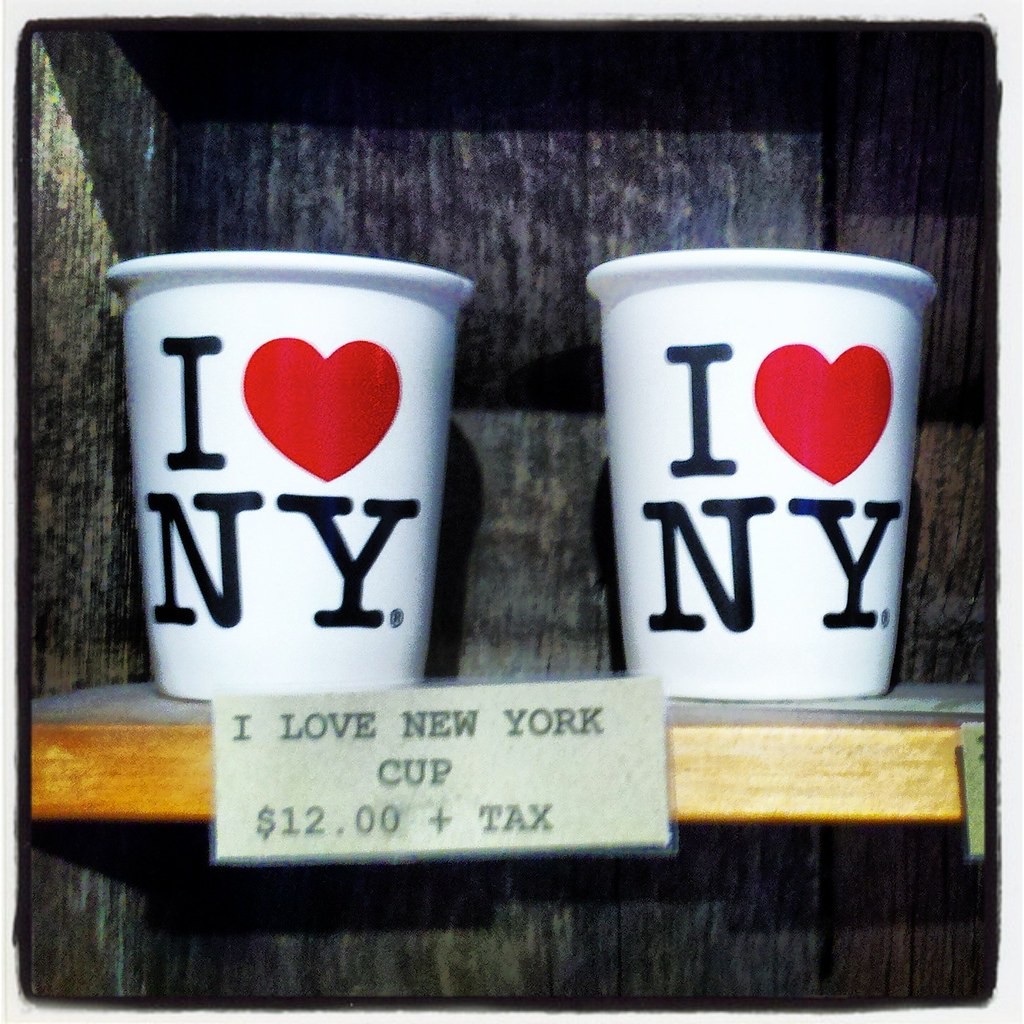
Milton Glaser’s “I ❤ NY” (“I Love New York”) logo is a well-known and well-loved symbol that has been met with massive success. It is recognizable on a global scale. The simple visual design has become the face of New York tourism — which is exactly what it was designed for. T-shirts, bags, pillows, mugs, snow globes, pens, and the list of souvenirs with Glaser’s design emblazoned on them goes on, and somehow nothing on the list feels surprising. The symbol is integral to tourist culture in New York City and has been adapted to a multitude of other cities as well.
The Empire State Development in New York holds the trademark for the design. It was produced without charge for a 1977 campaign to revitalize New York City. New York was facing potential bankruptcy in the 1970s and the Department of Economic Development hired the Wells Rich Greene Inc. advertising firm — which later reached out to Glaser — to help increase the dwindling number of tourists. In the years since its conception, the tourism industry has popularized the design and made it a prominent part of the city and state’s public image.
While it was originally designed for a New York state and city campaign, the design is used ubiquitously. The Department of Economic Development has tried to curb unauthorized reproductions, but the I ❤ NY logo is a prolific and lasting legacy for Glaser.
A New York City native born in 1929, Glaser grew up in the Bronx and attended the Fiorello H. LaGuardia High School of Music & Art and Performing Arts before matriculating to the Cooper Union for the Advancement of Science and Art.
After graduating from Cooper, he attended the Academy of Fine Arts in Bologna, Italy, on a Fulbright Scholarship. Glaser’s work in graphic design over the course of his fruitful career is well-known: he worked on a variety of projects including a poster for AMC’s “Mad Men,” the New York magazine logo, the album cover for “Bob Dylan’s Greatest Hits,” the design of the gilded Trump vodka bottle and a poster for the “Get Out the Vote” campaign for the 2016 presidential election, among other graphics. His extensive body of work has been featured in a multitude of exhibits.
His career in graphic design led him to co-found Push Pin Studios in 1954 and New York magazine in 1968 with Clay Felker. In 1974, he established Milton Glaser Inc., a company situated in lower Manhattan that specializes in print graphics work and interior and environmental design. Through Glaser Inc., he was intimately involved in the production of more than 300 posters for a variety of organizations, campaigns and customers.
The “I Love New York” campaign already had a commercial and jingle, but Glaser’s logo is the most lasting contribution.
Glaser died on his 91st birthday, June 26, 2020, in his Manhattan home. By the time of his death he had amassed a diverse and expansive portfolio, but the I ❤ NY logo that, according to the story, he designed in the back of a cab, is his most well-known work.
The original design was drawn in crayon on scrap paper, but it was later stylized to sport the type-font and stacked format that is well-known worldwide today. Glaser undertook the design project in the hopes of helping the city that he was born in find its financial footing once again. The logo now brings in around $30 million in revenue annually, with a significant portion going to the State Department of Economic Development.
The “I Love New York” campaign already had a commercial and jingle, but Glaser’s logo is the most lasting contribution. The campaign aimed to improve New York’s public image in the wake of high crime rates, stunted tourism and a lack of federal aid from then-President Gerald Ford in the 70s.
Before Glaser’s work on this project debuted his biggest claims to fame were a Bob Dylan poster and his visual work for the Windows on the World restaurant in the World Trade Center. He also had a significant body of work including pieces showcased in the Museum of Modern Art the year before.
His original sketch for the I ❤ NY graphic is now housed in MoMA, as well. While it was originally made to rebrand tourism in New York City, it is now used on a global scale; however, not all versions are authorized.
While it is unlikely that Glaser anticipated just how well the design would be received and the widespread impact and cultural significance it would have in the coming years, the I ❤ NY graphic is firmly situated in the public identity of New York City and affirms Glaser’s place in graphic design history.
After 9/11, Glaser released a new version of the logo, one that read “I ❤ NY More Than Ever” with a dark mark on the heart. While the State Department of Economic Development initially opposed the production of the new design, posters were spread throughout the city at Glaser’s request. The image was used to fundraise for those affected by the attack and to commemorate the tragedy. This new version was intended to bring the community together — and it is making a return in the midst of the pandemic. With the city once again facing hardship, people are trying to focus on what brings its residents together. Glaser’s design has withstood the test of time and still embodies that sentiment.
In 2020, shortly before his death, Glaser was working on a design that he hoped would help people feel a sense of community despite the pandemic. The simple yet eye-catching typographic design of the word “together” resonates with the uncomplicated design of his I ❤ NY logo that was made nearly 50 years prior. Both of these works were made in response to a city in crisis and aimed to bring people together.
Unlike the I ❤ NY design, the “together” logo was not for a campaign or to act as branding. Glaser started work on it near the beginning of the pandemic when New York was suffering in the wake of thousands of deaths and had only tentative hope for the future. The “together” graphic uses different fonts, coloring and patterns for the letters in the single-word design, and all the letters appear to touch the ones next to them to create a sense of unity despite the differences between them — something Glaser hoped would resonate globally.
Through his designs, Glaser captured the hearts of natives and tourists alike.