The Banner Lament: Wishing for OASIS?
June 23, 2011

Published: August 27, 2009
Remember the days of hating on OASIS? They are long gone, now that Fordham has finally implemented a new, up-to-date registration tool through the new my.fordham.edu portal: Banner. Banner is better, right? Not quite. The fatal flaw might be that the new technology is built upon the same fundamental system as the archaic OASIS, but Banner now has problems all its own.
One of the most commonly lamented changes to Fordham’s online registration system is that, unlike OASIS, Banner requires users to re-enter their Personal Identification Numbers (PIN) every time they wish to add or drop a class. Many students, most claiming to have been unaware of this change, threw away or misplaced their PIN after registering for classes. As a result, those who have needed to make changes to their class schedules have encountered sizeable difficulties, not just in remembering their PINs, but in retrieving them, as well. In many cases, students are unsure about whom to contact in order to find out their PINs; some of their e-mail inquiries have taken weeks to get responses and others have gone completely unanswered. The University Help Desk cannot provide PINs to students and advisors don’t always keep them on hand for their students, either. This was especially true mid-summer, when advisors were in vacation mode, away from the office, and frantic students sought to rearrange classes around that coveted internship they had just been awarded.
Banner does specify that PINs are necessary to make any changes, but it is likely that many students glossed over that warning in their rush to register before classes filled up. The Fordham-administered e-mails about registration only briefly mentioned the new policy, with little emphasis. Though a seemingly minor change, it is one that has affected a significant number of people—both students and the staff who must answer their queries. The repeated use of the PIN also seems somewhat redundant. Its primary use is to prove that a student has consulted with his or her advisor prior to registration. Advising, though a good idea, is not required for subsequent changes to class schedules, and even if it were, the PIN would still be meaningless unless a new one were issued at every advising session. The requirement to enter a PIN for every add/drop is an unnecessary extra measure that serves only to further infuriate Fordham students.
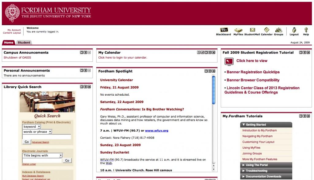
Another major complaint has been that the Banner layout is cluttered. In comparison to OASIS’s simple, straightforward style, there’s no question that Banner is considerably more difficult to navigate. Essentially, students used OASIS for three things: registration/class schedules, financial aid and grades. Those functions, among others, were always easy to find immediately after login. Banner, however, hides every one of them in the “Student” tab, lurking inconspicuously behind the home page. If the student is astute enough to notice and click on the tab, he or she is taken to a very busy page that, while it does include those features, mixes them among a host of other, less useful text boxes. Sure, the grade conversion key might be a useful tool, but all most students want to do is to figure out what time they have to get up for their earliest classes on Monday morning. The layout is so disorienting that, despite a prominent link to the course schedule front-and-center at the top of the page, one of the biggest student complaints is that they have been unable to locate their course schedules, even after extensive searching. The problem is that the most important features are smaller and less flashy than the more irrelevant ones that are smashed up against them, and the untrained eye doesn’t know where to go. Instead of heading right for “My courses” at the top, students are distracted by the unnecessarily large link to the now-defunct OASIS and the already outdated—but still inappropriately huge and maroon—Fall 2009 Registration Tutorials.
Banner might not be so disagreeable to students if the ever-advertised Help Desk could actually offer help. Unfortunately, it appears that the new system was implemented prior to working out technological kinks or ensuring that all administration knew where to direct student questions and frustrations. This, then, results in situations where students are faced with disappearing registration and are forced to spend three hours on the phone, being bounced between the help desk, the registrar and enrollment services, just to find out that nobody knew the system was down the night before. Fordham has become so good at the mass email blasts, alerting us to every light bulb that’s gone out anywhere on our three campuses, so why not alert appropriate offices of system malfunctions to alleviate the problem of angry students screaming at office personnel?
We know it’s not your fault, Fordham. It’s just been a string of bad luck with technology, right? But after years of working with just a few user-friendly lists of links, it’s no wonder students are nostalgic for OASIS. The only major upgrade is the addition of the new 21st Century stalking tool, which allows students to view the roster for any class in which he or she is enrolled. And that, my friends, may just make all of the Banner frustrations worthwhile.


