Fordham to Redesign School Website
October 30, 2013
Fordham University’s Marketing and Communication Development Department (MCDD) is overhauling the fordham.edu website. Partnering with website design company mStoner, the tentative completion date is fall 2014.
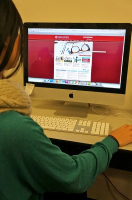
Director of Online Communications Donna Lehmann said her team is performing a “gut-renovation” to the current website. There will be a new user-centric hierarchy that displays the school calendar, news feed and social media outlets on the homepage. Each page will have a specific template.
Lehmann said many websites often create one website for iPhones, one for iPads, one for iPad minis and one for desktop computers. “The realities of maintaining these sites is horrible… The answer to this problem is responsive design,” she said. The new website will feature content optimized for the Web, instead of for print, as it currently is. “[Moreover], it will be mobile friendly,” Lehmann said.
Lehmann said that student participation in the design of the new website will include prototype testing, concept testing and user testing.
Lehmann’s blog about the progress of the new website, next.fordham.edu, will go live in approximately a month. She will update the blog frequently to keep the Fordham community updated on what is happening at each stage of the process.
The new website will use Jadu, a new content management system, to sort through the 16,000 pages of content the website currently has. According to Lehmann, some of those pages are irrelevant now. “This is an opportunity to clean out the closet,” Lehmann said. In her line of work, this cleaning-out process is known as a “content audit.”
According to Jim Kempster, senior director of MCDD, the website has not undergone a significant change in 14 years. He said there was a “re-skinning” in 2008, which changed only a few basic features on the site. “The website doesn’t look very modern…It’s time for a big change,” Kempster said.
Sajia Hanif, FCLC ’15, a tour guide and employee of the Admissions Office, said that she receives a lot of phone calls in the office from prospective students struggling to schedule a campus tour and information session. “If the school made it easier to schedule a tour online, we wouldn’t get so many phone calls… people would save time that way,” Hanif said.
When asked about the current website, Nick Withers, FCLC ’16, said, “It could be more appealing.” He thinks the homepage is boring. “It doesn’t look really advanced at all,” Withers said.
Alex Hladick, FCLC ’17, said, “It’s a little outdated, not that helpful… and I don’t like the aesthetic.” She also said that the website is hard to navigate. It fails to catch her attention. “It doesn’t make me say, ‘Go Rams!’” Hladick said.
“My high school website is better,” Sam Lee, FCLC ’17, said. “It’s so bland.” However, unlike Hladick, Lee does not find the website difficult to navigate.

