FCLC is One of the Ugliest Schools I’ve Ever Seen
FCLC Has Successfully Created One of the Most Unattractive Campuses in the City
May 31, 2011

Published: December 13, 2007
The Fordham College at Lincoln Center (FCLC) campus was established in 1961. The Leon Lowenstein Center was completed in 1969. As the Lowenstein building approaches its 40th year, it’s pretty evident that it has not aged well. The Leon Lowenstein Center was built in the cold-war era Brutalist architectural style. The raw concrete exterior with the repeated rectangular windows and block shape of the building make it look like a prison or socialist government building. The Fordham Law School is also a sad, pathetic heap of rubble. These buildings are uninviting, boring and generally ugly eye sores.
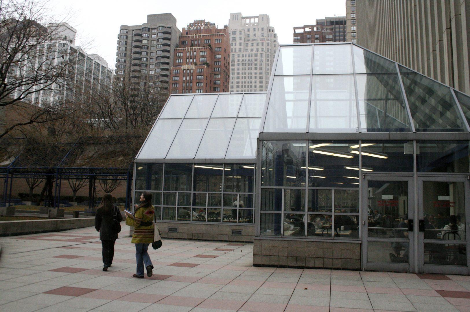
As if the building’s exterior wasn’t offensive enough, the interior continues the visual mess. If the school color is maroon, then why are so many doors and window frames painted blue? I don’t understand why the blue is even being used. Maybe there is some logical reason for this choice and I’m just ignorant to it; it’s not obvious to me or most other students. The most flagrant example of this insipid blue trimming is the entrance of the building. The all-glass waiting area and insubstantial excuse for a coffee shop are the most blaring examples of a misguided attempt to create an inviting space where students can sit and have a cup of coffee while waiting for the Ram Van or a meeting. This space is void of any personality and has a vibe that is less comfortable than a gynecologist’s waiting room.
What happened here? Did the designers say, “Hey, let’s create a space that’s totally mundane and uncomfortable”? The most detestable part of the entrance is the track lighting and those dead topiaries. This space needs, at the very least, some subtle tints on the windows and lighting fixtures with less harsh spot lighting—more inviting seating options and a potted palm sure wouldn’t hurt. Fordham should take a lesson from Juilliard and create an entrance that is modern, inviting and beautiful.
The Plaza is a pleasant roof-top garden space that is functional and is reasonably aesthetically pleasing. This would actually be a really nice space if it weren’t for all the carcinogenic smoke created by all of our tobacco industry-supporting buddies who light up and slowly kill themselves out there.
But, let’s return to the interior of the building—why does our cafeteria suck so much? The entire cafeteria room is an interior design joke. There have been some haphazard attempts to improve things though. There are new LCD TVs hung on the walls, which are a good addition, but did anyone work out the logistics of positioning the TVs or what will be shown on them? Sometimes it’s sports and news, which is great, but other times it’s the Fordham cable channel. No one wants to watch that. What’s the point of buying those expensive TVs and sucking up electricity if you’re going to show us something less entertaining than a screensaver? Also, the TVs are positioned way too high from people’s eyes if they are sitting down. A large segment of the seating area wouldn’t be able to see anything without having eyes like a hawk. There seems to have been a real breakdown of purpose when it came to implementing these TVs.
Then, there is the additional seating area in that glass tent, which looks and feels a lot like the entrance. It is one of the most uncomfortable eating spaces ever, and I feel like I’m in a fishbowl. There is such a feeling of being watched in the space because it is so dreary and bare that while eating in there, you become more interested in the outside than in what you are eating. That would not be the case if there were less windows and if the furnishings provided intimacy and comfort. The entire adjacent dining area is an unnecessary space; considering the abysmal job they did designing it, it should have just not been attempted in the first place. Adding insult to injury, the heating out there sucks as well.
The classrooms in the building vary. The inside of the graduate school classrooms are very nice, and the respective floors of the graduate schools are rather stylish, especially the business school floor. Now, the undergraduate classrooms—Lord baby Jesus in heaven, those orange, blue and green chair desks are a crime against all that is holy and right in this world. Then, you have those rusted vents that make hissing sounds and classrooms without projectors. On the fifth floor, there is a hole in the ceiling that is covered by construction paper and duct tape. The FCLC administration should be ashamed. This hole has been there all semester, with the tape constantly giving out and that forsaken piece of pink paper hanging down. It’s extremely unsightly.
In fact, I would dare to say that most students feel that FCLC campus is generally unprepossessing when compared to the campus at Rose Hill and other schools such as Baruch College and NYU—we, FCLC, are one ugly school. It would be ideal if they could just tear it down and start completely over, but that won’t happen, just like the rest of Fordham’s renovation plans. Seriously, those plans have been on the table since the 1990s, yet we haven’t gotten as much as a new wing. An entire decade has gone by, and all we got were those ridiculous white benches, dead topiaries and blue paint. Kudos, Fordham! No wonder wealthy alumni are flooding the school coffers with millions for those new high-rises you’ve been planning for over a decade.


